Colors
This metafictive alignment with Scotty makes identification with him strong, but another reason the point of view shots, and really all shots, affect the audience so greatly is the tremendous use of color. In a time when Technicolor has gone overboard, Hitchcock uses it meaningfully to create deeper character identification. Johnson claims that “colors interact to enhance or diminish one another’s effectiveness” and also that “color sharpens the viewer’s perception of the screen image” and “enhances any emotional or dramatic content in the film” (5, 8).
In Vertigo specifically, “color complements are utilized, noticeably green/red and black/white, to connect characters to each other,” and the fluctuations between these different color schemes represents the fluctuation of vertigo, and the viewer’s dizzying perception. (Calabrese 53)
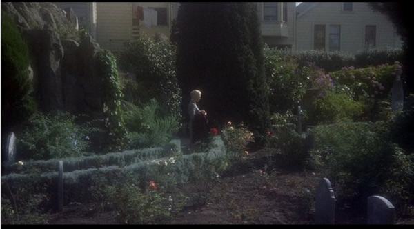
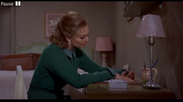
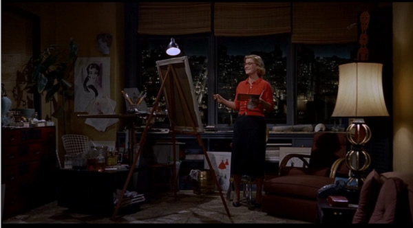
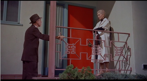
The color green becomes Madeleine/Judy’s color in clothing and lighting;
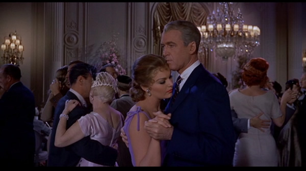
red is the color of passion, whether rage or eroticism;
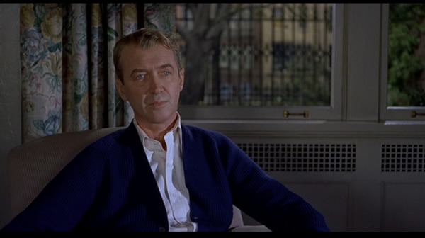
blue, a receding color, is constantly how Scotty dresses;
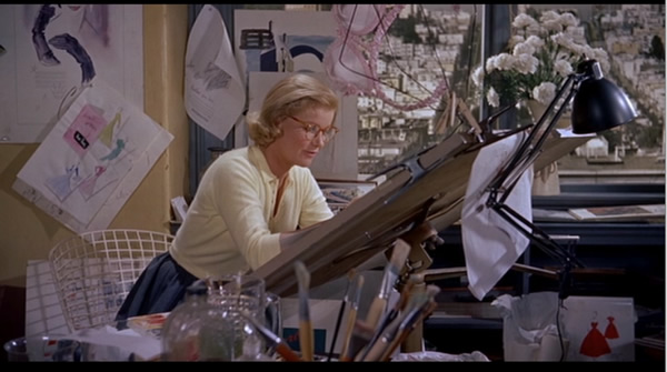
browns and tans in most of the interiors and Midge’s dress seem bland;
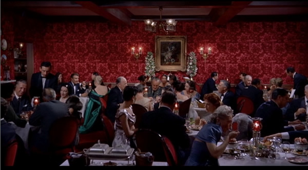
black represents death on Madeleine but also shows sophistication and glamour;
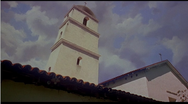
white buildings stick out in starkness of reality.
In the end, the characters/themes are identified with a specific color, which heightens attachment and emotion towards them, especially since the film presents them so blatantly for staring pleasure.